Day of install - first up:
protected the floors & appliances
MEASURE TWICE
CUT ONCE
KARMA back splash
(recycled glass - cut in Italy from the company called TREND)
Mini-subway tiles are more in proportion to the scale of this space
and NERO STELLA counter tops
(a more graphite color, with a recycled glass 'dust' mixed in)
BEFORE
AFTER
BEFORE
AFTER
BEFORE
AFTER
BLACK STAR finish for bar area:
larger 'flakes' of recycled glass mixed in
Within 12 hours last Thursday, the mini-kitchen reno was complete, including sink & faucet hook-up, five cup-pulls installed, cleaning and putting select pieces back into place.
Templates (all taped together here) 2 wks. prior to install
Mike the plummer was first to arrive the day of the install,
and he removed the old (ugh white sink & chipped faucet)
He came back LATER after counter install to hook-up the faucet & GD)
Searched online, but price for this model all the same.
(purchased this at local Lowes)
With an artisan sink at 60/40, it could not take the facet with a plate.
(Faucet installed at industry standard at 4", and NOT centered to the drain)
Tweaking the counters (already constructed)
edge cut on site to ensure 'fit'.
After the pieces were all in place, they REMOVED EVERYTHING,
epoxied the counters, and than installed the counter to set.
Because NO DEMO, that means NO TRASH going to a landfill.
The epoxy used is also green - oderless and edible.
BEFORE: 2002 BUILDERS WHITE
AFTER: DRAMATIC - especially at NIGHT!
Will be adding four more wireless puck lights under the above cabinets
Speaking of add,
I truly believe we added value to our home,
for when the market turns around, but without over doing it...
and I didn't choose a B&W mosaic tile,
because I feel like it's becoming 'too trendy'
Cup pulls (from Lowes) added to the updated look for a mere $25
Tomorrow, the living room update will be posted. If you need anymore information about this kitchen update, contact me at nyclq@comcast.net.
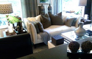
More harmonious color palette between the spaces...


OOOOOOOOOOO, chica! I am so loving it! Great choice of backsplash too. You know I love me some white cabs & black counters. Turned out truly fantastic-- lucky girl! ;)
ReplyDeleteReally beautiful. I love the backsplash. I agree the two rooms are really great together now. You have done a wonderful job.
ReplyDeleteThanks Jill and Mona!! =)
ReplyDeleteI loved planning it and seeing it come to life. Our "home" feels complete (that is, until the next season come rolling in... lol)
Lynda
Lynda, that looks beyond fabulous! What a difference it made! Great colors, great choices, great look!
ReplyDeleteaww congrats on your new kitchen!!! It looks gorgeous and so perfectly YOU :)
ReplyDeleteFantastic work! I really like the final product and the transformation! The tile backspalsh is gorgeous. It really speaks of elegance and class without a break-the-bank renovation feeling. Right up my alley. I'm in the middle of 'redoing' some of my home too. I guess a decorator's home is never done. Too many ideas and options to choose - we can't NOT try them! Thanks for sharing!
ReplyDelete