FROM THRIFTED TO ON TREND FOR SPRING

Pick up any shelter magazine, and you will for sure see touches of gold being the trend metal and color to add. Back during the start of holiday, I had experimented with a few touches of gold: I painted some chargers, pumpkins, and my beloved modern round mirror. I laughed to myself as I painted the mirror from silver back to its original state of gold. I never knew the infatuation would grow so deep. This past weekend, I went hunting for a gold coffee table, and although I didn't find one, I did find one I could transform with yet another shot of gold.


$15 thrifted table: simple update sprayed gold.

Previous (gifted) table and subtle pops of pink earlier in January.

I had been looking forward to getting up to Faith Farm Thrift for their sale they were going to be having. Although when I went on Saturday, most pieces were already sold on Thursday and Friday, I did venture over to another thrift shop I knew of in the area. I should have taken a picture of the table when I found it - but I didn't - I just wanted to get it home (plus I had other errands to do). The table was wedged into a mattress bin. But there she was - just enough detail to not be too ornate, and clean lined enough to work with expecting pieces in our home. Added bonus: faux bamboo looks for furniture is still trending.


Thankfully my seats of my Jetta fold down and I have a blanket with me to wrap glass & mirror, so I was able to fit it into my car with no problem. We had plans to go out early Saturday evening, so I tucked the table into the garage until I could get to painting it on Sunday.


BEFORE

AFTER

After the hubs left to go pick up some Super Bowl eats, I laid out my drop cloths in the driveway, brought the table outside, wiped it down and gave it a good two coats with Rustolleum's Metallic finish color called Gold Rush (same color gold I already had from the Fall). I also sprayed a clear matte top coat to help seal it and make it easier to clean. I let it sit in the garage overnight to dry well and cure. This morning I brought it inside. I'm liking the warm and fresh look of the gold paired with pink & white, and can't wait to add some shots of grassy green to the mix.


I love using our home to experiment with new looks.

Two colors I would have NEVER ever thought
I could love or live with: Pink & Gold.

I wish the shag rug were a little bigger - Note to self: hunt for one! lol

As I had mentioned in a previous post (Projects To Do) I'd like to experiment with pairing two colors and more patterns to mix. I'd like to find some zig-zag pink pillows and green and white trellis pillows, but I just may need to take on the task of sewing them myself - another task to try this year from my project list. In the meantime, I simply used a hot pink pashmina I already own and two hot pink pillow covers I did find for only $5 at Ikea. I used another pink scarf on the Barcelona chair which picks up on the pink blossoms and I stacked a few magazines with pink covers on the ottoman. It's safe - and slowly but surely starting to evolve into a welcoming Spring.


I liked an ad I saw in a West Elm catalog of different white vessels collected on a fireplace mantle, so I recreated the concept on our wall unit. I paired the painted gold mirror with my collected white vessels I already have. The clear glass container is to add white pillar candles to. My friend Jose gave me some fabric samples I hope to be making into pillow covers shortly - Lord knows - I certainly do not need the inserts! lol


Over in the dining room, I reused the LOVE quad wall art I made last year (From My Spring Love post), but rather than have them on the wall behind the dining table, I used them at the entrance buffet for a shot of bold pink on our already pale grey walls. Keeping all the accessories in white gives the space a fresh crisp look (although I think the white shades could use colored banding along the bottom). I even lucked out and found pink panels at Ikea for only $10

My bare branches are also still coming in handy (also trending for home decor). These I got for free (found on the side of the road) back in September for Fall, now they have pink blossoms for Spring.


At the time I found the table and set the space above, it wasn't 100% of what I was envisioning, but sometimes you just have to live in a space, and let it - and your style - evolve over time. That's also what makes collecting so fun! Anyone can walk into a store and bring home the pretty displays. But taking your time to collect, hunt and gather your finds and discover knew looks (or yourself) along the way takes a little more patience. I added in some green, and evolved into this for Spring...


Another thrifted find: 1960's gold detail glasses.
Too pretty for storage - I'm using for tealights.


SPRING 2011

and now the table and space have
transitioned into Summer and into Fall...


SUMMER 2011


FALL 2011


LINKING POST TO:


THE STUDIO MAKEOVER

Hi all!! Can you believe not only is the weekend here, but we're into the second month of a new year?? I know I've been so consumed with sourcing shops for the Color Splash team and helping out with makeovers while maintaining our home front, and it really just feels like this past month just flew by! I know most of you are buried in snow, but down here in Florida, we're already starting to feel the effects of longer days (YAY! More sunlight!)


All photos captured by Lynda Quintero-Davids.

 
As promised, here's some before and after shots of the studio makeover, accomplished by just five of us gals (Patricia, Gina, Laura, Kathy and myself), in basically two days, with minimal money spent. Basically the only money spent was on purchasing more clear totes for snacks and food in the kitchen area, storage boxes to conceal some of the samples collected over time, mobile office supply containers and hired two guys to paint a few walls one afternoon (grey and blue).


Two days before the move, Kathy and Gina had measured most of the studio, so that Gina could input the info to come up with a CAD drawing. The Associate Producer, Lauren, also asked me what I thought of the current layout and if I could come up with an option for Julie and the crew to choose from - so I did what I usually do - I came up with Option A, B, and C. We had a meeting the following day, and we all agreed it would be between option C and Gina's plan, so both plans were faxed to Julie. And even though Option C was chosen, we tweaked it along the way. And the camera crew also has done some tweaking for depth in their shots...


Yes - Laugh. I don't know CAD - but I can
sketch, cut & paste the hell out of any space plan and
help move it to make it happen! =)

The A, B & G plans were rather safe - lining things up to the wall and boxing off areas, but for option C I had utilized what I remember a teacher telling me - "Don't always play it safe" and "Whenever you're given something, go with it don't fight it." Keeping that in mind, considering the open loft space and taking a cue from the current layout, Option C incorporated "floating" spaces by using 45 degree angles. I use to do it in the store as well, and for some reason, angles get met with resistance. However that may be, the space still turned out amazing after we were done moving it around, cleared the clutter, and created a few vignettes...


Although I did try the angled seating area and adjacent office table, I was was out-voted (and I'm the newbie so I didn't argue). I moved forward to work on the two wall units, unloaded the two carts of stuff we had emptied off them to move them, and styled the shelves to reflect the creativity in the space. To help empty out the office (to be revealed later) I was going to utilize some of the accessories paired with all the sample books. Patricia got a jump start on that by bringing over all the extra pillows out of the office storage. I brought over some of the unlabeled paint cans - in black to help ground all the color and give weight along the bottom on the unit. Bringing over the two orange Bobby Berk chairs helped create a possible new area to film "Options" in (which they did and I got to see in action yesterday!! VERY cool!)


Patricia had the brilliant idea of grouping the rest of the paint cans by color blocks, and labeled all of them with simple grey duck tape and a black marker (I love when things are organized!! And this now is!!). The silver and black cans give an industrial look to David's new painting area, and also framed the window by using them on either side. It also created a great little nook to stack all of Davids canvases - which were removed from all their shopping boxes. The added bonus: both paint can fixtures are on wheels so it makes it easier for the camera crew to move around for a shot if needed.


Speaking of organized... here's some more details of the studio makeover...


David's Painting Supplies

David's Painting Supplies


Mobile office supplies:
I picked up this glass tray at Ikea for 9.99
along with some glass vases to hold pencils from HomeGoods.

One of two studio work tables

Utilized 3M Command Hooks to hang 3M headsets off column.

It's been a VERY cool experience to see behind the scenes of how a show is produced, all it takes to "get the shot", moving the studio around to create depth in the shots, and the importance of lighting....


Sofa angled to create depth.

Babushkas moved to float and add color.

Multiple lighting sources.

Hope you enjoyed the Color Splash Studio tour. As with any makeover for anyone, who it was for is HAPPY and that's what matters most. Yesterday, while I was helping clean-up over at the makeover house, David paid me a tremendous compliment that made me VERY happy. He said, "You're so neat and organized - I love it!"


Studio Office - Before

The office got a little tweaking too... I'll show that next week.
Today I'm off to thrift because Faith Farm is having a SALE!

Have a wonderful weekend!


LINKING POST TO:


50s 60s 70s LIVING TOUR

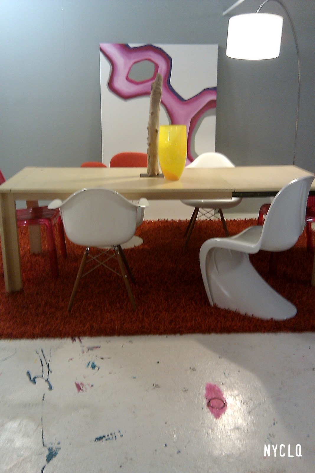
If you're ever down south in Florida, a hip vintage shop to check out is 50s 60s 70s LIVING. It features an eclectic mix of moderate (to high) priced unique vintage case goods, tables, sofas, chairs, accessories, lighting and art. If you're looking to invest in a functional piece of art to update your traditional look with a twist, most pieces can work within your mix. Specializing in mid-century modern furniture, this is also where dealers come to buy in Ft. Lauderdale, Florida.


50s 60s 70s LIVING
1200 NE 4th AVE
FT. LAUDERDALE, FL 33304
P: 954.767.8000
F: 954.471.4587


LinkWithin

Related Posts with Thumbnails